2026
OQTANE — Lijay Gaikwad Portfolio
Type Brand Identity & Visual Design
Course MA Graphic Design — Major Thesis
Institution University of Huddersfield
Year 2024

OQTANE

A motorsport fashion brand built from concept to complete brand identity — where the adrenaline of racing meets the sophistication of style.

View project ↓ See deliverables
Scroll

Overview

A new era in
Motorsport
Fashion.

Brand Identity Visual Design Typography Sub-Branding Packaging Website Design Marketing Product Design

OQTANE is a hypothetical motorsport-themed fashion and apparel brand, created as the major thesis project for my MA in Graphic Design at the University of Huddersfield.

The project involved researching, conceptualising, and designing a complete brand from the ground up — one that sits at the intersection of high-performance motorsport culture and contemporary fashion.

Born from a personal passion for Formula 1 and the observation of a genuine gap in the market: the absence of a fashion-forward, lifestyle-driven brand that authentically speaks to motorsport enthusiasts beyond team merchandise.

The project spans visual identity, typography, colour systems, sub-brand architecture, apparel design, packaging, website design, and marketing — producing a complete, industry-ready brand system.

3
Sub-Brands Created
29+
Brand Guidelines Pages
40
Thesis Portfolio Pages
12+
Deliverable Categories
Product Vision

Designed
for the
Driven.

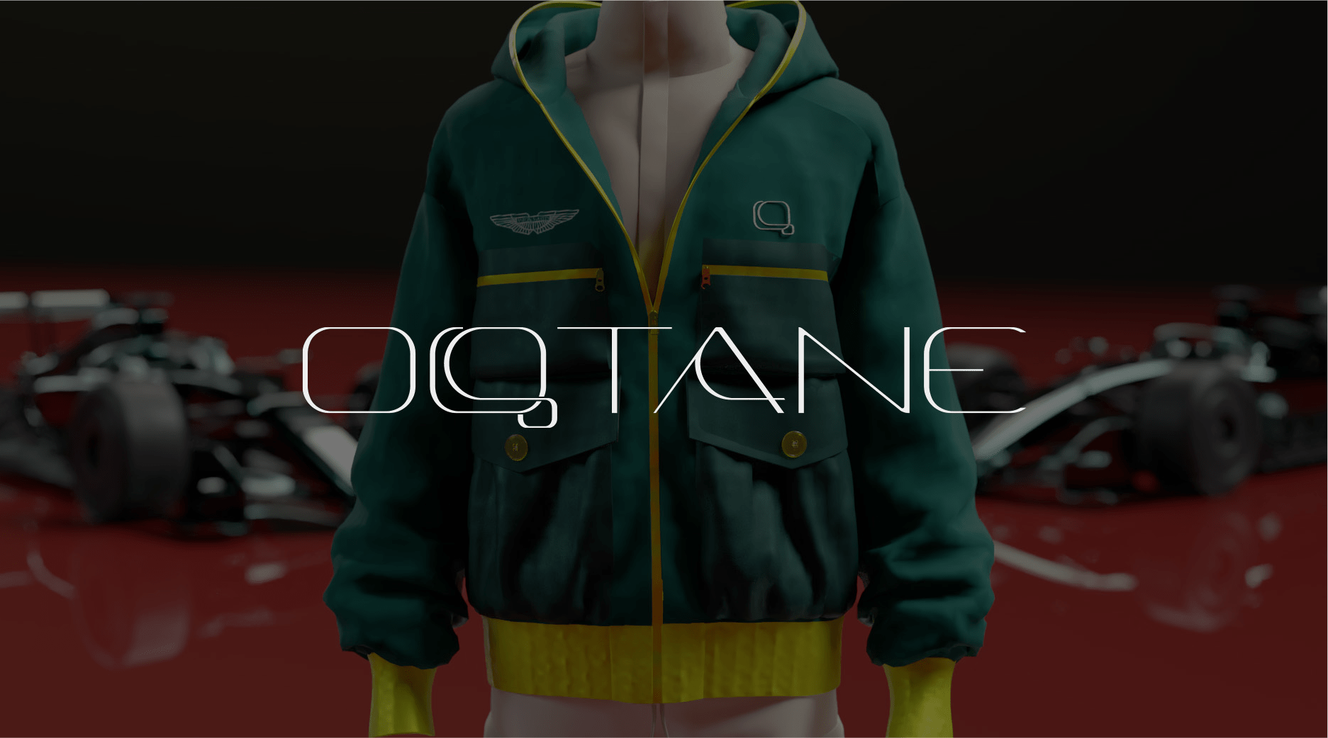
OQTANE was conceived as a premium lifestyle brand — not just an apparel line. The vision was to create a brand that empowers motorsport enthusiasts and trendsetters to express their passion through the way they dress, without compromising on style or quality.
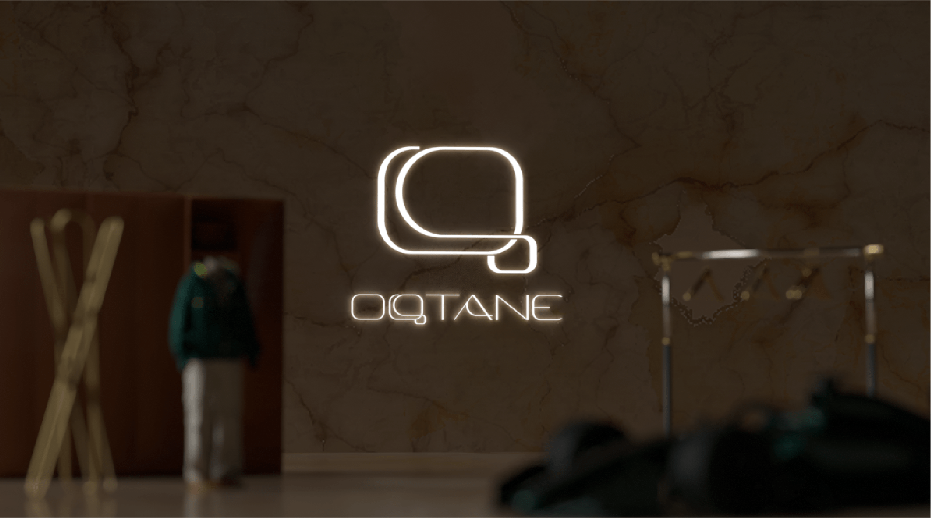
01
Performance
Apparel that draws from the precision and function of motorsport gear — aerodynamic silhouettes and technical craft.
02
Identity
A strong visual language rooted in speed and elegance — carbon black, championship yellow, and dark red.
03
Community
A lifestyle ecosystem connecting motorsport fans globally — from casual followers to dedicated racers.

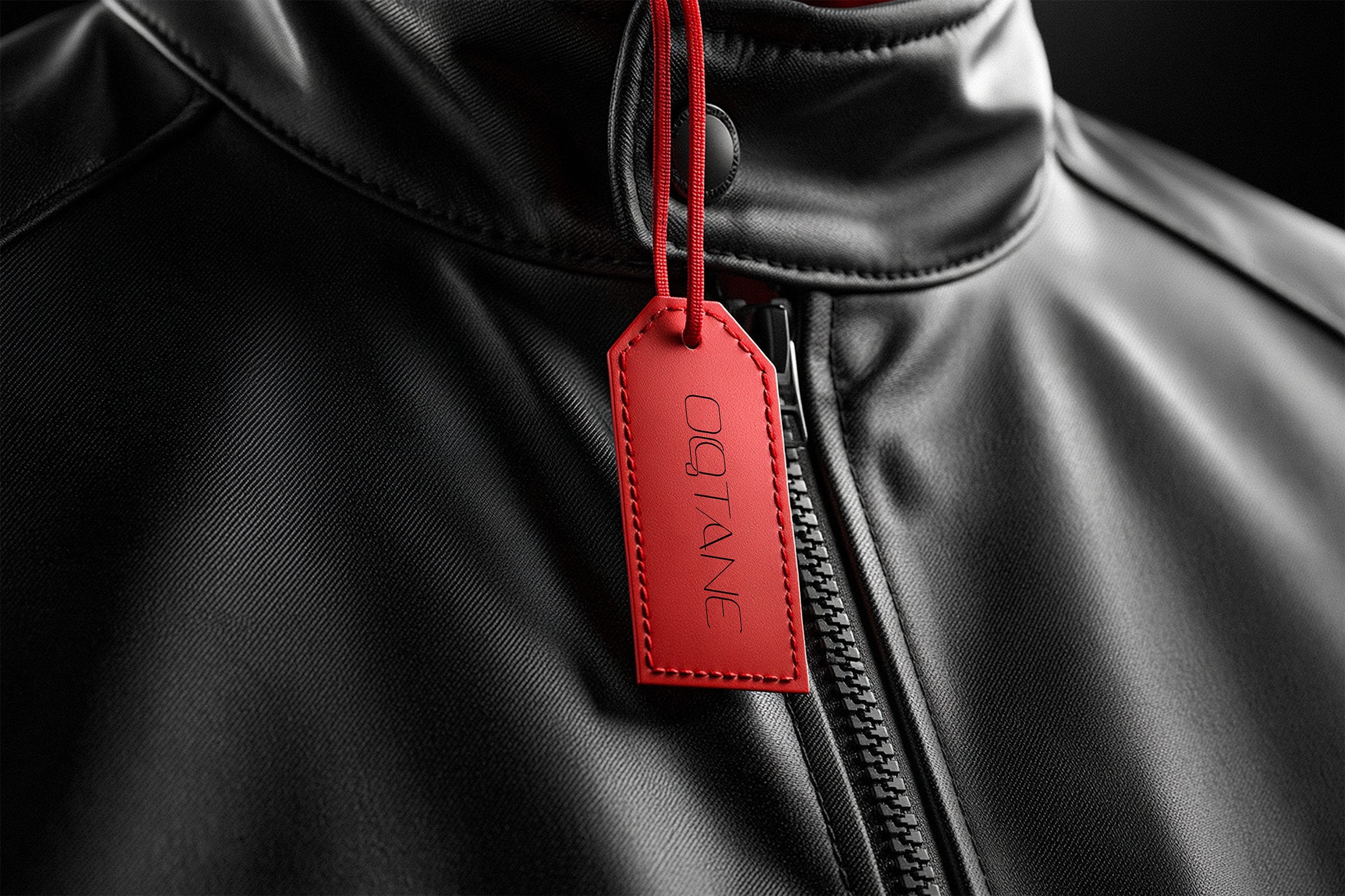
Derived from “octane” — the chemical measure of engine fuel performance — the name represents high performance, precision, and energy. The deliberate addition of the letter ‘Q’ adds distinctiveness, modernity, and a visual identity all its own.

The Q signals: Quality. Quest. Quintessential — a contemporary edge that implies the brand is about more than motorsports; it’s about pushing into uncharted territory in fashion.


Colour System
Carbon Black
Power & sophistication
Dark Red
Passion & energy
Vivid Yellow
Colour of champions
Off-White
Balance & clarity

Typography
Logo / Main Font
Yapari
Yapari Family
Draws from the same lineage as the Porsche wordmark — geometric, precise, luxury-forward.
Heading Font
Montserrat
Montserrat
Clean geometric sans-serif. Strong visual impact for headings and titles.
Body Text
Lora
Lora
A serif font adding elegance and sophistication. Ideal for product descriptions and long-form brand copy.
Accelerate your style.
At OQTANE, every piece is meticulously crafted to reflect the adrenaline and precision of motorsport — inspiring individuals to express their unique identities and embrace the thrill of the race.

Sub-Brand Architecture

Three distinct sub-brands were developed to target different consumer segments within the motorsport lifestyle space — each with its own logo, positioning, and identity.

01 / 03
Paddock Fashion
Casual Lifestyle
Casual clothing with motorsport themes — bringing the excitement of the racecourse into daily life. Chic and cosy apparel for fans to showcase their love for motorsports in any setting.
02 / 03
The Grid
Performance Gear
Performance gear specialist — gloves, race apparel, and vital equipment for motorsport enthusiasts and professionals. Safety and functionality without sacrificing design.
03 / 03
Bespoke
Luxury Edition
Upscale clothing and accessories for the affluent consumer. High-end, distinctive items that showcase a love of cars and admiration for exquisite craftsmanship — including the F1-inspired hanger.
“True champions don’t just compete — they make a statement.”
OQTANE Brand Mission Statement, 2024
Discovery Phase

Understanding
the market
first.

Before any visual work began, the project was grounded in in-depth research across the motorsport fashion landscape — tracing how racing aesthetics moved from track to runway, and mapping the current competitive landscape.

The convergence of Formula 1 and fashion has accelerated in recent years, driven by Netflix’s Drive to Survive, celebrity attendance at race events, and figures like Lewis Hamilton who openly bridge both worlds.

Competitors mapped: Puma Motorsport, Alpinestars, Sparco, Mercedes × Tommy Hilfiger, and Hugo Boss — each strong in their position, yet each leaving a gap.

The target audience: primarily under-35 motorsport enthusiasts, active on social media, community-driven, and quality-conscious — with a deliberate focus on inclusive design across genders.

Market Gaps Identified
01
Lack of fashion-forward collections beyond team-branded merchandise
02
Limited integration of sustainability in motorsport fashion
03
Women under-represented — far fewer options than male counterparts
04
No standalone lifestyle brand native to motorsport culture

Challenge & Solution
The Challenge
Building credibility in a space dominated by legacy names
Creating a motorsport fashion brand from scratch — with no existing equity, no licensing agreements, and no team affiliation — meant the identity had to work exceptionally hard. The brand needed to feel authentic to motorsport culture while standing on its own as a credible fashion label.

Additionally, designing within a space so closely associated with specific teams and drivers required careful navigation of intellectual property and trademark considerations throughout the entire design process.
The Solution
A proprietary visual language. A three-tier brand structure.
Rather than leaning on existing iconography, OQTANE was built on its own visual language — bold, abstract, and proprietary. The brand feels like a motorsport team in its own right, not a fan of another.

The three-sub-brand architecture (Paddock Fashion / The Grid / Bespoke) provided structural range across casual, performance, and luxury tiers — reducing dependence on any single market position and opening multiple revenue streams.

The Yapari typeface and the Carbon Black / Dark Red / Championship Yellow palette created a striking, ownable identity that communicates speed and luxury without replicating any existing team aesthetic.
Project Map
01
Phase One
Research
Market Analysis Competitor Mapping Target Audience Copyright Research Trend Analysis
02
Phase Two
Concept
Brand Naming Naming Rationale USP Definition Vision & Values
03
Phase Three
Visual Identity
Logo Design Colour System Typography Brand Guidelines
04
Phase Four
Brand Architecture
Paddock Fashion The Grid Bespoke Logo Suites
05
Phase Five
Product & Packaging
Apparel Direction F1 Hanger Design Retail Packaging Wholesale Packaging
06
Phase Six
Digital & Marketing
Website Design E-Commerce UI/UX Social Media Assets Hamilton Collaboration
07
Phase Seven
Documentation
Brand Guidelines Doc Portfolio Compilation
Outcomes

A complete
brand,
built from
zero.

Every element designed to work cohesively — from a hanger in-store to a campaign ad. The final outcome was a fully resolved brand identity system ready to compete in the motorsport fashion market.

Brand Identity & Guidelines Document
Primary Logo, Secondary Logo & Monogram
3 Sub-Brand Logos (Paddock, Grid, Bespoke)
Brand Colour System & Typography Guidelines
Graphic Patterns & Visual Assets
Apparel Design Mockups
Staff Apparel Applications
Retail Packaging — Black & White Box Editions
Wholesale Packaging Design
F1-Inspired Hanger (collab — Yash Chandaliya)
Website & E-Commerce Design Concepts
Lewis Hamilton Collaboration Campaign
Social Media Posts & Banner Designs
Store Ambience Visualisation

CONTACT FORM